Custom Form components
Splade comes with a great set of built-in Form Components, but your application might require a custom component as part of a form. There are several ways to implement this, so we’ll look at implementing the same custom component differently.
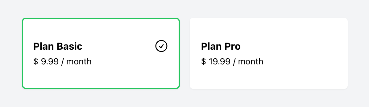
Card Select component
The component we'll be implementing is a card selector. In this example, two cards represent a subscription plan (basic or pro). Clicking on one of the cards will update the form data, as the cards are built around a radio input element. Here's what it looks like:
Blade implementation
First, let's take a look at a Blade implementation. This implementation works without any custom Vue components. For the sake of simplicity, we'll hard-code both plans, and we don't extract each card into a separate component.
<x-splade-form default="{ plan: 'basic' }"> <div class="flex flex-row justify-center space-x-4"> {{-- Plan Basic --}} <label class="w-64 cursor-pointer rounded-md shadow-sm bg-white border-2 py-8 px-4" :class="{ 'border-white': form.plan !== 'basic', 'border-green-500': form.plan === 'basic' }"> <input type="radio" value="basic" v-model="form.plan" class="sr-only" /> <div class="flex flex-row justify-between items-center"> <span class="font-bold">Plan Basic</span> <svg v-show="form.plan === 'basic'" class="w-6 h-6" xmlns="http://www.w3.org/2000/svg" fill="none" viewBox="0 0 24 24" stroke-width="1.5" stroke="currentColor"> <path stroke-linecap="round" stroke-linejoin="round" d="M9 12.75L11.25 15 15 9.75M21 12a9 9 0 11-18 0 9 9 0 0118 0z" /> </svg> </div> <span class="text-sm">$ 9.99 / month</span> </label> {{-- Plan Pro --}} <label class="w-64 cursor-pointer rounded-md shadow-sm bg-white border-2 py-8 px-4" :class="{ 'border-white': form.plan !== 'pro', 'border-green-500': form.plan === 'pro' }"> <input type="radio" value="pro" v-model="form.plan" class="sr-only" /> <div class="flex flex-row justify-between items-center"> <span class="font-bold">Plan Pro</span> <svg v-show="form.plan === 'pro'" class="w-6 h-6" xmlns="http://www.w3.org/2000/svg" fill="none" viewBox="0 0 24 24" stroke-width="1.5" stroke="currentColor"> <path stroke-linecap="round" stroke-linejoin="round" d="M9 12.75L11.25 15 15 9.75M21 12a9 9 0 11-18 0 9 9 0 0118 0z" /> </svg> </div> <span class="text-sm">$ 19.99 / month</span> </label> </div></x-splade-form>Let's break down what's happening here. First, there's a Form component with a default basic plan.
<x-splade-form default="{ plan: 'basic' }">Then there are two Cards built around a label element. The border color is based on whether the plan is selected or not.
<label :class="{ 'border-white': form.plan !== 'basic', 'border-green-500': form.plan === 'basic' }">Within the label element, there's an input element. It has the value set to the plan and two-way binding by setting the v-model to form.plan.
<input type="radio" value="basic" v-model="form.plan" class="sr-only" />Lastly, an SVG element (checkmark icon) that's only visible when the plan is selected.
<svg v-show="form.plan === 'basic'"> <path d="..." /></svg>Extract Card into Blade Component
We begin by creating a new Blade Component. As this is a fairly simple component, we'll create an anonymous component with only a view:
php artisan make:component CardLabel --viewThen, we can move the Card component out of the form and paste it into the new Blade component view. We'll replace all hardcoded values with variables. To pass PHP values to Vue, always use Laravel's @js directive. Note how the radio input element uses a :value attribute (with a colon).
<label class="w-64 cursor-pointer rounded-md shadow-sm bg-white border-2 py-8 px-4" :class="{ 'border-white': form.plan !== @js($plan), 'border-green-500': form.plan === @js($plan) }"> <input type="radio" class="sr-only" :value="@js($plan)" v-model="form.plan" /> <div class="flex flex-row justify-between items-center"> <span class="font-bold">{{ $title }}</span> <svg v-show="form.plan === @js($plan)" class="w-6 h-6" xmlns="http://www.w3.org/2000/svg" fill="none" viewBox="0 0 24 24" stroke-width="1.5" stroke="currentColor"> <path stroke-linecap="round" stroke-linejoin="round" d="M9 12.75L11.25 15 15 9.75M21 12a9 9 0 11-18 0 9 9 0 0118 0z" /> </svg> </div> <span class="text-sm">$ {{ $price }} / month</span></label>Lastly, we'll update the form to use the new component:
<x-splade-form default="{ plan: 'basic' }"> <div class="flex flex-row justify-center space-x-4"> <x-card-label plan="basic" title="Plan Basic" price="9.99" /> <x-card-label plan="pro" title="Plan Pro" price="19.99" /> </div></x-splade-form>Vue implementation
Instead of building the Card component with a Blade template, you could also create a custom Vue component. Again, there are many ways of doing this, but let's show two examples corresponding to the Blade examples.
Matching the first Blade example, you could create a Vue component that contains both plans. We'll create a PlanSelector.vue component and pass the form object as a property. By passing the entire form object to the component, you can interact with it within the Vue component by using the Form API. Remember to register the custom Vue component in the main app.js file.
<template> <div class="flex flex-row justify-center space-x-4"> <label class="w-64 cursor-pointer rounded-md shadow-sm bg-white border-2 py-8 px-4" :class="{ 'border-white': form.plan !== 'basic', 'border-green-500': form.plan === 'basic', }"> <input type="radio" value="basic" v-model="form.plan" class="sr-only" /> <div class="flex flex-row justify-between items-center"> <span class="font-bold">Plan Basic</span> <svg v-show="form.plan === 'basic'" class="w-6 h-6" xmlns="http://www.w3.org/2000/svg" fill="none" viewBox="0 0 24 24" stroke-width="1.5" stroke="currentColor"> <path stroke-linecap="round" stroke-linejoin="round" d="M9 12.75L11.25 15 15 9.75M21 12a9 9 0 11-18 0 9 9 0 0118 0z" /> </svg> </div> <span class="text-sm">$ 9.99 / month</span> </label> <label class="w-64 cursor-pointer rounded-md shadow-sm bg-white border-2 py-8 px-4" :class="{ 'border-white': form.plan !== 'pro', 'border-green-500': form.plan === 'pro', }"> <input type="radio" value="pro" v-model="form.plan" class="sr-only" /> <div class="flex flex-row justify-between items-center"> <span class="font-bold">Plan Pro</span> <svg v-show="form.plan === 'pro'" class="w-6 h-6" xmlns="http://www.w3.org/2000/svg" fill="none" viewBox="0 0 24 24" stroke-width="1.5" stroke="currentColor"> <path stroke-linecap="round" stroke-linejoin="round" d="M9 12.75L11.25 15 15 9.75M21 12a9 9 0 11-18 0 9 9 0 0118 0z" /> </svg> </div> <span class="text-sm">$ 19.99 / month</span> </label> </div></template> <script setup>defineProps({ form: { type: Object, required: true, },});</script>Then in the Blade template, you'd use this component and pass the form object:
<x-splade-form default="{ plan: 'basic' }"> <PlanSelector :form="form" /></x-splade-form>Replace Form object with v-model
Instead of passing the entire form object to the Vue component, you could also use a v-model directive:
<x-splade-form default="{ plan: 'basic' }"> <PlanSelector v-model="form.plan" /></x-splade-form>Then we'd need to update the Vue component to work as a custom input. We'll replace form.plan with modelValue, and replace the v-model directive on the input element with :checked and @change attributes.
<template> <div class="flex flex-row justify-center space-x-4"> <label class="w-64 cursor-pointer rounded-md shadow-sm bg-white border-2 py-8 px-4" :class="{ 'border-white': modelValue !== 'basic', 'border-green-500': modelValue === 'basic', }"> <input type="radio" value="basic" class="sr-only" :checked="modelValue === 'basic'" @change="$emit('update:modelValue', 'basic')" /> <div class="flex flex-row justify-between items-center"> <span class="font-bold">Plan Basic</span> <svg v-show="modelValue === 'basic'" class="w-6 h-6" xmlns="http://www.w3.org/2000/svg" fill="none" viewBox="0 0 24 24" stroke-width="1.5" stroke="currentColor"> <path stroke-linecap="round" stroke-linejoin="round" d="M9 12.75L11.25 15 15 9.75M21 12a9 9 0 11-18 0 9 9 0 0118 0z" /> </svg> </div> <span class="text-sm">$ 9.99 / month</span> </label> <!-- Other plans... --> </div></template> <script>export default { props: { modelValue: String, }, emits: ["update:modelValue"],};</script>Again, this works fine, but you don't want to hardcode the plans into the Vue component.
Extract Card into Vue Component
Let's take the Vue implementation one step further, and extract the Cards into a dedicated Vue component. We'll name this component CardLabel.vue. As the plans are now dynamic, we'll add a plan, price, and title property:
<template> <label class="w-64 cursor-pointer rounded-md shadow-sm bg-white border-2 py-8 px-4" :class="{ 'border-white': modelValue !== plan, 'border-green-500': modelValue === plan, }"> <input type="radio" :value="plan" class="sr-only" :checked="modelValue === plan" @change="$emit('update:modelValue', plan)" /> <div class="flex flex-row justify-between items-center"> <span class="font-bold" v-text="title" /> <svg v-show="modelValue === plan" class="w-6 h-6" xmlns="http://www.w3.org/2000/svg" fill="none" viewBox="0 0 24 24" stroke-width="1.5" stroke="currentColor"> <path stroke-linecap="round" stroke-linejoin="round" d="M9 12.75L11.25 15 15 9.75M21 12a9 9 0 11-18 0 9 9 0 0118 0z" /> </svg> </div> <span class="text-sm">$ {{ price }} / month</span> </label></template> <script>export default { props: { modelValue: String, plan: String, price: String, title: String, }, emits: ["update:modelValue"],};</script>You can use the new CardLabel component in the Blade template:
<x-splade-form default="{ plan: 'basic' }"> <div class="flex flex-row justify-center space-x-4"> <CardLabel v-model="form.plan" plan="basic" title="Plan Basic" price="9.99" /> <CardLabel v-model="form.plan" plan="pro" title="Plan Pro" price="19.99" /> </div></x-splade-form>Renderless Vue component
Vue also supports renderless components, which don't include a template section. So in the example below, the total value will be updated whenever the price or amount value change.
<x-splade-form> <Calculator :form="form"> <x-splade-input label="Price" name="price" /> <x-splade-input label="Amount" name="amount" /> <x-splade-input label="Total" name="total" disabled /> </Calculator></x-splade-form>We'll pass the form object to the Vue component again and then set up watchers for the price and amount values, which will call the updateTotal method:
<script>export default { props: { form: Object, }, watch: { "form.amount"() { this.updateTotal(); }, "form.price"() { this.updateTotal(); }, }, methods: { updateTotal() { this.form.total = this.form.price && this.form.amount ? this.form.price * this.form.amount : 0; }, }, render() { return this.$slots.default({}); },};</script>